The mark is an arrow in the gold: a straw archery butt on a yew stand, with the shaft standing out of the centre. In the ballads Robin wins the archery contest at Nottingham; in the retellings he splits his rival's arrow in the gold. The rings are his colours: Lincoln green for the hood and cap, scarlet for the feather in it (and for Will Scarlet), gold for the centre of the target and the prize. We take the margin out of software and give it back to the people who use it, and we aim to hit the gold every time.
Four versions. Use the full-colour mark on light backgrounds and the reversed mark on dark ones. The one-colour version is for stamps, embossing and anywhere only one ink is available.
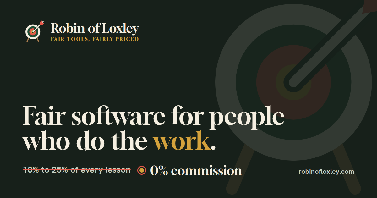
Every app in the family carries the badge in its footer, linking back here. The social card is what appears when robinofloxley.com is shared.
Green does the work: buttons, links, what we charge. Scarlet is the accent and is used sparingly: what they charge, the fletching, one call to action per screen. Gold is the centre of the target: emphasis on dark backgrounds, never body text on a light page. Straw and yew come from the kit: the butt, the bow and the stand. Neutrals are warm, never grey. Tokens live in tokens.css.
#10261A · --rol-sherwoodHeader bands, dark surfaces.
#1F4D35 · --rol-lincolnPrimary. Buttons, links, our prices.
#C0392B · --rol-scarletAccent. Their prices, one CTA, alerts.
#D4A23C · --rol-goldThe centre of the target; numbers and highlights on dark.
#F5EFE1 · --rol-parchmentPage background.
#FCF9F2 · --rol-linenCards and tables.
#E9D7A6 · --rol-strawThe face of the butt. Illustration and fills.
#6B4A2B · --rol-yewThe longbow and the stand. Rules, small detail.
#DCE7D8 · --rol-mossQuiet fills, status tags.
#17201A · --rol-inkText.
Gloock is a bookish, high-contrast serif for headings and prices, with a little of the ballad about it. Hanken Grotesk is a plain, warm sans for everything you read. Both are open-licensed (SIL OFL) and served from this site, so no visitor data goes to Google.
Gloock 400 · headings, app names, our prices
Hanken Grotesk 400–700 · body, labels, buttons, and every screen inside the apps. Nothing smaller than 13px.
The look is woodcut: square-ish corners, heavy ink rules, an offset ink shadow on the one surface that matters, and a near-black band at the top. Prices always come as a pair: theirs struck through in scarlet, ours in green.
Every app shares the type, the neutrals, the layout and these pieces from components.css. Each owns one accent colour, set with data-rol-app on the page, and its own mark. Pick an app to see the same screen in its colour. The system is written up in DESIGN.md.
The same header, buttons, form and price pair in every app. Only the accent changes.
We send the receipt here. Privacy
Example figures. Real pages name the source and the month checked.
A card: linen, a hairline, 6px corners, no shadow.
British English. Short declarative sentences. Numbers instead of adjectives. We name the incumbents' prices and let them do the talking.